Verizon Assistant

Context
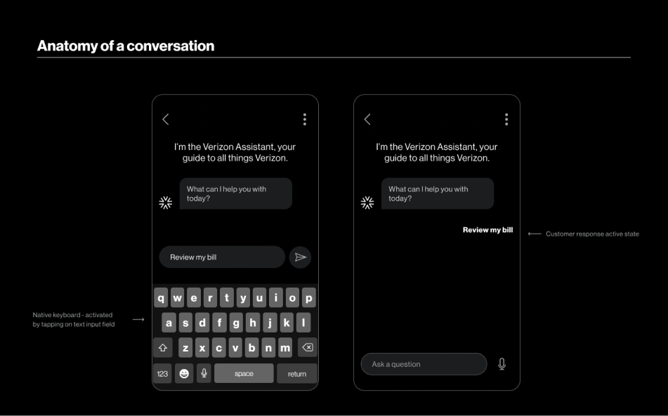
The Verizon Assistant is the conversational AI assistant that lives across Verizon’s ecosystem of products. It can be used as a voice assistant with hardware products, or a conversational assistant through interfaces.
Overview
Throughout the project, I was responsible for auditing the current experience with my co-designer, creating storyboards with design leads and PMs, and designing high-fidelity prototypes to help with design system documentation.
Role
UX Research, Interaction Design, Visual Design
tools
Figma, Miro
timeline
Oct 2021 - Jan 2022
team
Product Designer
1 Copywriter
1 Product Manager
2 Design Leads
Challenge
An inconsistent experience
The Verizon Assistant did not have an established visual design system that offered a consistent user experience. Across the product ecosystem, the assistant looked different across Verizon’s mobile apps, web, tablets, etc. This would only become more disjointed if Verizon continued to increase it’s product offerings.
Solution
A system redesign
To tackle this challenge, we set out to redesign the design system and create established guidelines and foundation, and ultimately build a consistent user experience with the Assistant across Verizon’s ecosystem.
Impact
New foundations for future teams
  • A more consistent user and brand experience across all conversational experiences with the Verizon Assistant
  • Newly updated guidelines, documentation, and components that can now be used and further developed for conversational experiences for 10+ products within their ecosystem
  • Faster and more efficient design processes for designers at Verizon on the Assistant/conversation design team
APPROACH
How did we create and deliver a design system?
Given our timelines, and the ask to create an entire design system, the team took on the approach of auditing the current design system and the assistant’s current state. This helped us design scenarios to test components being made in the design system, and help us discover how designers would use them along in their daily work.
Problem discovery
To understand our current state, we conducted an audit of the assistant
Before we started, our client and PM categorized 31 consumer journeys that involved any potential interactions between Verizon and consumer.  As the assistant was most commonly used on the My Verizon App (MVA) and we had a short timeline, we prioritized auditing the customer journeys on MVA.

Across the the 31 journeys, we found evaluated them with 2 guiding questions:
  • Did the assistant understand the user’s question?
  • Were we able to complete our ask?
These were our findings

14/31

The assistant understood the question

9/31

The assistant was able to complete our ask

2/9x

The assistant was able to completed our task better than just using the app
Product goals
Our audit helped develop our strategy and form guiding principles for the design system
  1. Guiding Components

    It was hard to follow the assistant's guidance for information-heavy journeys without a component that presents information in an organized and readable way.
  2. Interactive Journeys

    The components lacked interactivity, leaving users to start from scratch after being navigated to a feature. We aimed for the assistant experience to feel more task-accomplishing.
  3. Increase readability

    It was hard to follow the assistant's guidance for information-heavy journeys without a component that presents information in an organized and readable way.
Design
Storyboarding scenarios, and finding common components
Product, client, and the design team we came together to come up with certain scenarios to prototype. Our scenarios were derived from the remaining consumer journeys that did not satisfy any of our audit criteria, and the most common consumer journeys. For confidentiality reasons, I can’t show every scenario in detail.
Scenario Example: Building security and trust with the Assistant
After being sent a promo to update their data plan, a user is looking to understand all their options before confirming
Breaking down components
After designing all the scenarios, we were able to define interactive areas and determine hierarchies for each type of information. We explored multiple options before finalizing the "foundations" of the components in for design system.
Final product
Proposed foundations and guidelines
Altogether, the scenarios emulated real situations and uncovered what components/documentation were needed. I can’t show the entire design system, so here are some examples of written guidelines.
Next steps
Moving onto new platforms
During the design process for our foundations, new unreleased versions of products were being tested with the design system to see if it was compatible in them. Hopefully in the near future, we’ll see the system being used by designers for products that have yet to be launched as I’m writing this case study!
Takeways
Communication
While building a design system for existing products, we also considered branding, product ecosystems, and creating a personality that matched Verizon's brand, Since the assistant had touch points across all products, I learned to communicate design decisions to multiple teams and clients a simultaneously.
Finding opportunity in constraints
At the start of our process, I struggled to research and audit Verizon's current ecosystem. Initially, I focused on the assistant's intelligence and capabilities instead of how users felt. By the end, I learned to think of the assistant's intelligence as an opportunity to be creative and improve the user experience, rather than a constraint that made design difficult.
Prioritization and efficiency
With more time, I would have compared the assistant’s performance across all products, and interviewed real users to form stronger assumptions about the assistant’s abilities. However, given our limited timeline, I learned to prioritize and efficiently gather information by completing the audit with my designer, rather than scheduling interviews and finding participants.